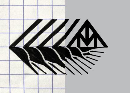
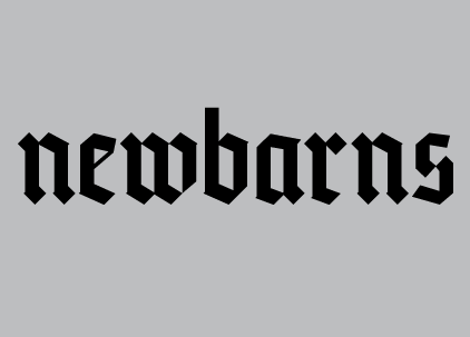
Newbarns Brewery Identity
In developing the identity, the brewery wanted to look outside of the world of beer branding, leaning more on the style of graphic logo used by international organizations and corporations of the mid-20th century, while the logotype connects to the historic use of blackletter in brewery identity.